
Overview
Providers in the audiology space were leaving our platform for competitors that allowed them to assist patients directly during the financing process.
Our existing experience required patients to complete the application independently via an SMS or email link — a major obstacle for elderly patients and providers with older staff who often lacked the technical comfort or devices to complete online forms on their own.
To close this gap, we designed a new in-office patient application and transaction flow that allows patients to complete financing directly on the provider’s tablet or computer — with clear guidance and guardrails to ensure compliance
Problem
“Our competitors make it easy for providers to help patients apply for financing right in the office. We don’t.”
Key Challenges:
Audiology providers often serve elderly patients who struggle with digital forms or mobile links.
Many front-office staff were older and lacked confidence using online tools.
Patients frequently dropped off when asked to check their phone or email to complete an application.
Providers wanted to guide patients through the process but were limited by compliance boundaries.
The result: high application abandonment and frustrated providers opting for competitors with a smoother, guided in-office experience.
Goal
Design an in-office experience that:
Lets patients apply and complete transactions directly on the provider’s device.
Keeps providers in a supportive, compliant role.
Removes SMS/email dependency.
Enables a seamless Application → Transaction handoff with one verified session.
Launches under a feature flag for gradual rollout and feedback.
Research & Insights
I conducted interviews and internal feedback sessions with audiology providers, front-desk staff, and customer support teams to understand their workflow and pain points.
Key Insights
Technology literacy gap: Elderly patients and staff struggled with digital forms and device switching.
Trust matters: Patients felt more comfortable when the provider helped explain payment plans.
Compliance uncertainty: Providers wanted to assist but needed clear guardrails.
These findings defined our design principles:
Clarify who acts next (provider vs. patient).
Keep interactions simple, visual, and sequential.
Maintain security with OTP verification but minimize re-entry.
Design Approach
I began by mapping the current and ideal-state journeys for both application and transaction processes to locate friction points like device switching, OTP repetition, and role confusion.
Design Objectives
Support a shared-device experience (provider → patient).
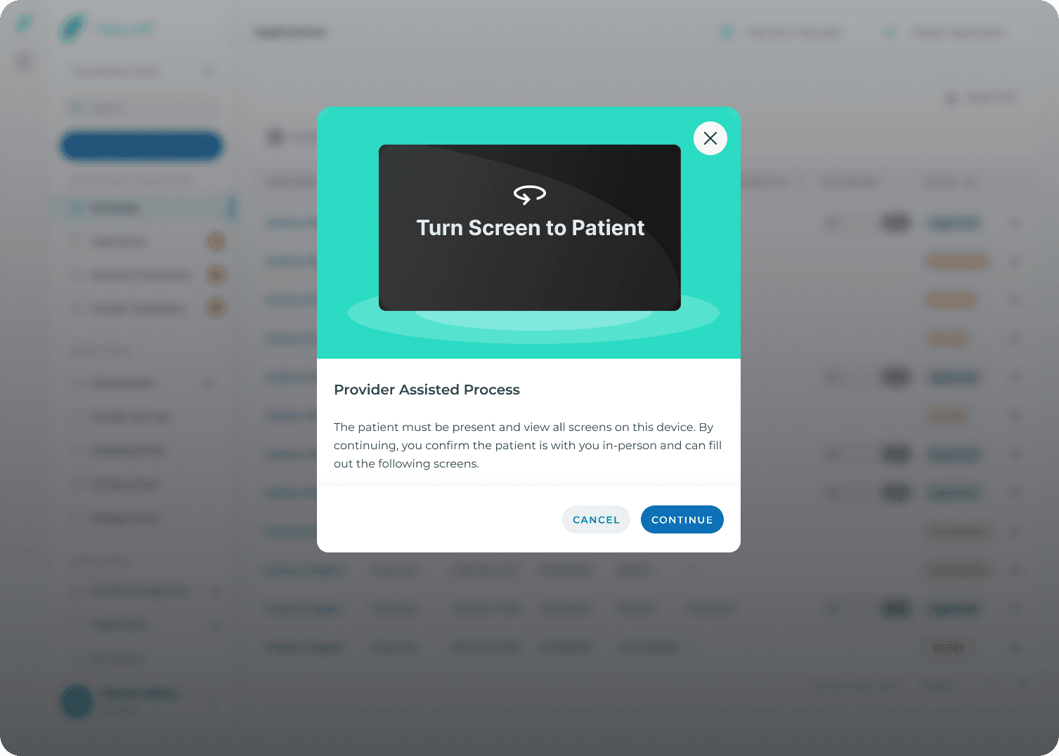
Use motion and messaging to clearly indicate handoffs.
Create a continuous OTP session across both flows.
Keep UI elements simple for low-tech users.
Design Solutions
1. Application Flow Enhancements
Before:
Providers could only send an SMS or email link, forcing patients to complete the process alone.
After:
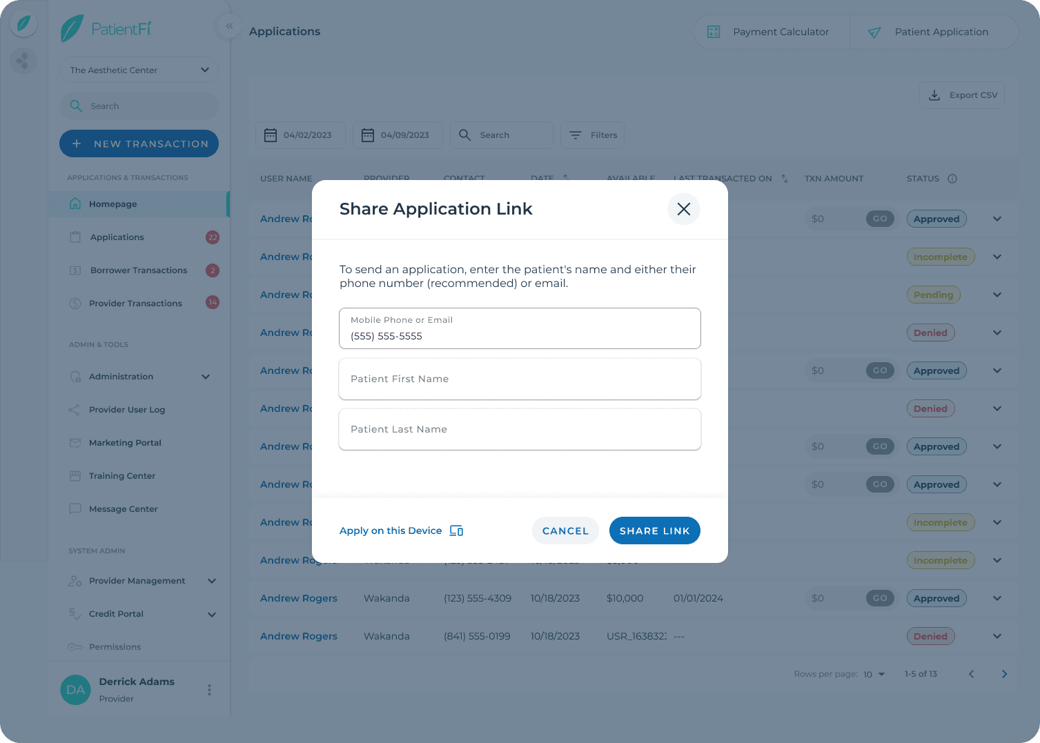
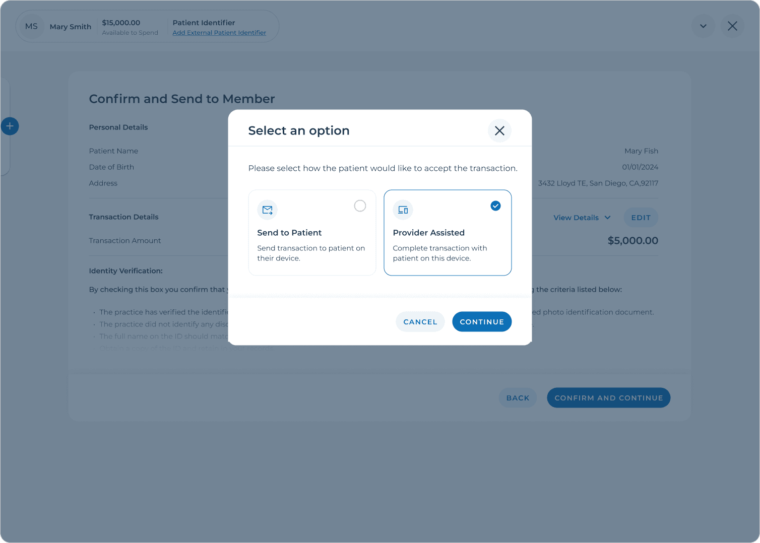
Replaced “Send Application Link” with “Patient Application.”
Added an “Apply on this device” option for shared-device usage.
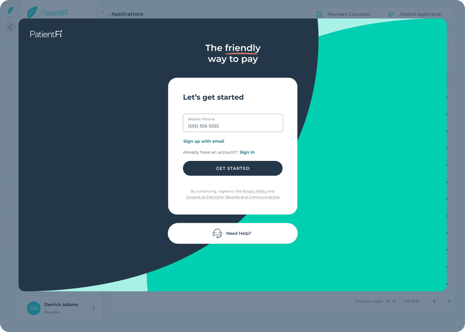
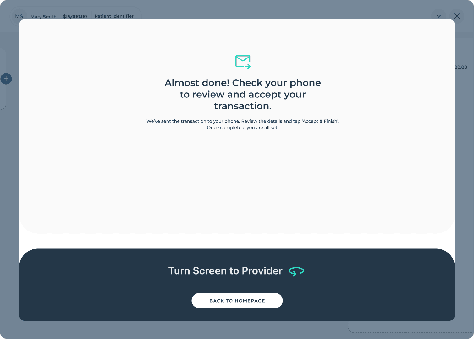
Introduced automated “Turn Screen to Patient” animation to visually signal handoff.
Pre-filled patient info entered by provider for speed and accuracy.
Displayed provider message reminding them that the next steps are for the patient.
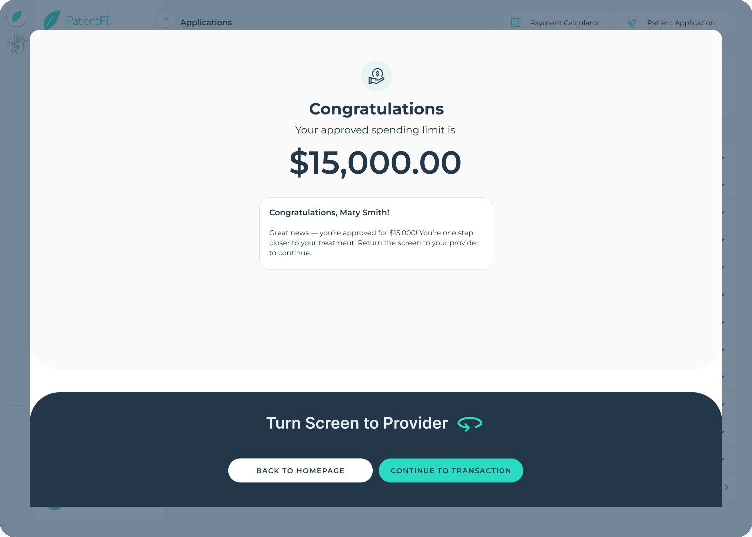
Added Glowing Hands animation on approval for reassurance and delight.
Enabled direct continuation to the transaction flow without re-verification.
2. Transaction Flow Enhancements
Before:
Patients had to log in again via OTP after completing an application, creating friction and confusion.
After:
Added “Continue to Transaction” option after approval to skip redundant OTP.
Updated CTA to “Confirm and Continue.”
Removed pre-selected plan options for transparency.
Deferred down payment processing until “Accept & Finish.”
Maintained compliance through clear handoff messaging and role guidance.
Outcome
The new in-office flow bridges a critical usability gap for audiology providers serving elderly patients.
The design reduces reliance on personal devices, empowers providers to guide patients responsibly, and streamlines the financing process into a single session.
Key Takeaways
Designing for shared devices and low-tech users required rethinking ownership, privacy, and accessibility.
Clear visual handoffs and motion cues (e.g., screen rotation) built confidence for both parties.
Early collaboration with compliance and engineering ensured feasibility and legal alignment.
Focusing on human empathy over digital efficiency created a more inclusive experience.
Next Steps
Collect quantitative data post-launch to measure completion rates and drop-offs.
Conduct usability testing with elderly patients and staff for accessibility optimization.
Expand shared-device support to other healthcare verticals (dental, optical, veterinary).
Final Reflection
This project reminded me that inclusive design isn’t just accessibility — it’s empathy in action.
By enabling providers and patients to complete the financing journey together, we transformed a previously fragmented process into a seamless, guided, and trustworthy experience.

